There’s nothing too glamorous about text on a page.
The beauty of words is that they paint pictures in the mind, but when you consider the typically black-and-white composition of lines, dots, and curves on an otherwise blank backdrop, well, words themselves are nothing to write home about.
Having worked in marketing for the past nine years, I’ve discovered there are few things as exciting as unveiling the visuals for a project. Forget the spreadsheets and other planning documents, the copywriting, and the technological components that may follow; the day a client sees her new logo or his new homepage for the first time is by far the most impactful point in the project.
I’ve been known to use the phrase “putting the pretty on it” when describing the evolution from mere words to engaging imagery. The moment there is color and shape and form, that’s when a project starts to feel real.
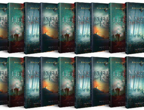
I’m no exception to the phenomenon, which is why I was so eager earlier this week to meet with the artist working on the covers for The Renegade Chronicles—and to preview three possible concepts.
I am delighted to share the fruits of his labor with you not only because the cover concepts make this whole enterprise feel “more real” to me (and, hopefully, to my future readers as well), but also because very soon, I will have to tell him which concept to finalize for Rebels and Fools and adapt for Heroes and Liars and Martyrs and Monsters (the other two books in the series). I need to choose the winner, but before I do, I’d love to solicit your insights.
In other words, please judge my book by its (prospective) cover!
How can you help?
Take a look at the potential packages for my forthcoming fantasy novels and answer these questions in the comments section below:
- Which of the three concepts would most likely prompt you to purchase the book?
- What tweaks, if any, would you make to your favorite cover concept?
- For each of the three concepts, what type of story would you expect to find behind the cover?
As always, I appreciate any and all feedback immensely!


Dave, I really like the bottom two. If you took the picture from the middle and the font and logo from the bottom, I think that would be awesome.
Thanks, Andrew! I appreciate your feedback.
How exciting!!! I have read fantasy books while in middle and high school, but not many (if any at all) during my adult life, so I hope you don’t mind me putting my 2 cents in here. After I came about my own opinions, I also asked my 11 year old son what he thinks of the covers…
1. I prefer 2 or 3. As a person who doesn’t read much fiction, I like that #2 gives my imagination a starting point to set the scene. BUT #3 is super cool (love the depth of colors and aged font) and could lure me in just as easily –mysterious is a word that just came to mind. My son said he likes #2 the best.
2. I’m not going to be much help with this question. Your artist did a fantastic job. If anything, I might agree with the others on a color change for option #1 if you decide to go that route.
3. At first sight, the first cover made me think of western style characters (cowboy hats, etc…sorry!). I did NOT read your post carefully and skimmed over the word “fantasy” – needless to say, this little accident made sure that my opinions of each cover are not biased toward fantasy 🙂
Anyway, after taking another look, the font made me think of Ireland, but that could’ve been persuaded by the green colored background.
My son and he says this cover makes him think about war and the Hunger Games.
The second cover prompts me to think of kings and knights…and obviously castles. The light near the sword gives off a magical glow which makes me think there’s a bit of fantasy included. The lonely crow gives me the impression that there are some doom and gloom battles to come. I love the illustration; the castle and landscape/sky are beautiful. I can imagine travelers having to venture for miles to get there.
My son says it looks like medieval times; the landscape looks like there’s rubble, and witches or evil spirits come to mind.
The last cover also makes me think of knights and castles. Again, the symbols around the sword give the feeling of fantasy. That, accompanied by the “Fools” font, make me think of wizardry (if that’s even a word).
My son says he thinks of multiple clans during medieval times. He thinks of slaves who are enemies to greedy kings/knights.
———————————
Can’t wait to go to your book signing! 😉
Wow…thanks for taking the time to type all of that (and thank your son for me). It was very helpful!
I was definitely drawn to #2. Looks like a good movie too!
Thanks, Barb!
Hi David,
I like #2. I can’t really think of any specific changes I would make.
#1-makes me think the book will be filled with lots of battles-which is my least favorite part of fantasy(or any)stories.
#3-this just looks like the generic fantasy book cover-i don’t find it really intriguing or interesting.
this is super exciting-when will you let us know which one you picked?
Great feedback, Kim…thanks! I’m having a follow-up meeting with the cover artist this morning. I think I’ll wait until he’s made some final tweaks to “the winner” before making the big announcement…maybe next week…
In general, I prefer art that is more personal and individualistic—less common, conventional, or commercial. I think it works best if it means more to the reader after the reading is done. Not having read the Chronicles, I prefer the first choice, but think the second would be most popular, and am not at all enamored by the third….
Thank you for your insights, John!
4 people who read Sci Fi and fantasy all said the middle one. The glossy one.
Thanks, Bill!
Hi, David,
My preference is for the first. It strikes me as literary, sophisticated, Tolkeinian. Less common, more accomplished. I think all three designs are excellent. The simplicity of the first appeals to my minimalist sensibilities, I think. That doesn’t mean it’s a great marketing ploy. But it might be. If anything is missing it’s the hook that jumps out and says “this is fantasy, folks!” The observer has to see the map in the background. If I were to choose this design I would play with some other fonts and see what I get. If I went with the design I would publish subsequent books in a different color. Red, then blur, then yellow, for example. Exciting work.
Wonderful…thanks for posting, sir!
I love the first one. It seems more literary and the most sophisticated, but it seems very Tolkien-esque. Maybe that’s a good thing if the book IS Tolkien-esque. The third one is too … violent? Wouldn’t appeal to me at all. The second one is OK. It seems less refined than the first one. Less sophisticated.
Wow, thanks, everyone, for chiming in. Between these comments and the ones left on my Facebook page, I certainly got a lot of feedback. I’ll post the “winner” in the next week or so!
One more comment… the second one looks like the cover for a computer game. It’s super nice, but it doesn’t scream “book” at me.
Thanks for your feedback, Jaime!
I like the design of the first one, but I also had an immediate association with Tolkien with that design. So if the series is nothing like Tolkien, or you aren’t intentionally trying to bring in Tolkien fans, that design might be an issue.
The second one is my least favorite. There’s something kinda cheesy about it, or maybe just too generic. I’m not sure what it is. The castle, maybe? I don’t hate the sword and the hilt helping with the “F,” but the lens flare….Maybe that’s my big issue. It looks like Myst, but a Myst that’s been given an update to adequately render pretty lens flare. Myst: HD Edition. But then you play it and it turns out that the lens flare didn’t really add much to the game and you really need to stop falling for those marketing tactics where you re-buy a videogame just because the graphics have been improved, but you say that now when you know you’ll be buying Final Fantasy X for the PS8 because dammit Yuna’s story still gives you the feels.
I kind of like the third one. Bold impact colors. Sharp, pointy design. Is it fantasy? It might not be, or if it is, this is Game of Thrones fantasy where people drink and fornicate and kill and that’s just breakfast.
I guess at the end of the day, they’re all kind of derivative, which sounds harsher than I’m trying to be. Tolkien, I Heart 90s Fantasy, or Game of Thrones. Is one of those in the spirit of what this series will be?
What if you broke from tradition and went for a cover that didn’t owe as much to the genre?
Dave, your feedback was some of the most amusing I read. I very much agree that the “chosen one” will have to reflect the story. To answer your final question about deviating from what’s already out there, I think that’s something of a two-edged sword (pardon the pun). There’s a reason why trends (and, yes, cliches) exist; there’s a reason why genres exist: they serve as short-cuts for consumers who wouldn’t otherwise take a second look at something.
So while I love the idea of breaking the mold, I (as creative director and client) told the artist to explore these types of options. Truth be told The Renegade Chronicles are very much sword-and-sorcery fiction. Of course, there’s another series I’ve written/am working on that would benefit from something very outside of the expected, and I daresay those cover concepts will take more risks.
1. Which of the three concepts would most likely prompt you to purchase the book?
Number one, definitely. It’s gorgeous. I love the backdrop, the ‘old’ feel of it, the almost whimsical-ness of the old map.
2. What tweaks, if any, would you make to your favorite cover concept?
Change the font from stark-white to matching the parchment edges of the cover. Right now it’s too ‘stick font on picture;’ that will make it more integrated.
3. For each of the three concepts, what type of story would you expect to find behind the cover?
Number one looks like my type of book; looks like a lighter read, or an uplifting one, an adventure story. Lots of atmosphere and a band of likeable characters.
Two looks like a movie adaptation. Pretty, but ultra-commercial. I would expect plenty of action and for it to be a bit main-stream.
Three looks very dark, and very male-oriented. I would probably not read three, though I like dark books. It doesn’t look like it was written for me. Then again, I have no idea what your book is like; perhaps it is, perhaps it isn’t, but with that cover, I’ll never know.
Good luck with whichever you choose!
Thank you very much for your insights!